POSTS
The Apple Watch
By astrophoenix
After five weeks with apple watch, here are some thoughts on the various faces.
Note: when I refer to a half complication, below, I’m talking about the one which will only show the date, the day of the week and the date, or nothing.
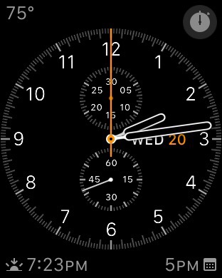
Chronograph
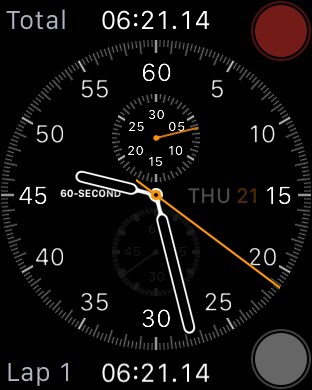
The chronograph face allows four-and-a-half complications and is one of my favorite faces, thanks to discretely small hour-indicator numbers, beautiful hands and layout, and one-tap access to start the chronograph (which is mission-critical on my wrist!). Unfortunately the second hand is mostly useless because of its small size and how often it’s obscured by the main hands.
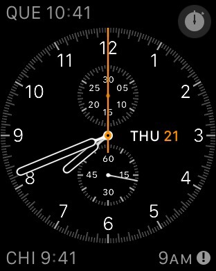 Further, when the chronograph is running, you can’t see the notifications indicator. Or any other complications for that matter!
I’ve never seen the normal second hand on the watch while chronograph was running until I looked at this screen shot! In real life it’s invisible when chronograph is running.
It sounds like I have more to complain about than like with the chronograph face. I have not yet talked about how much I love the way it looks though, and how well it satisfies my technical/engineering sensibilities. Returning to the chronograph face from any other face feels like coming home.
Utility
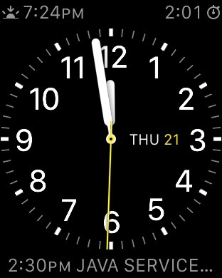
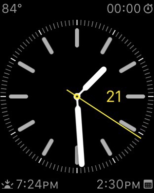
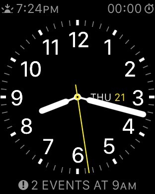
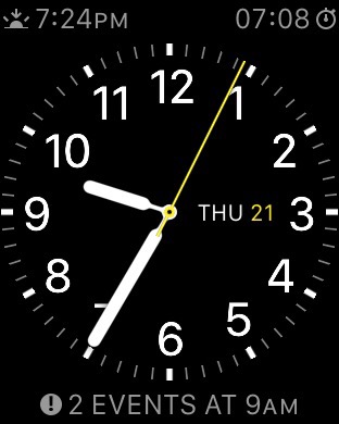
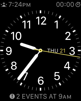
The utility face is my other favorite. Three-and-a-half complications. The required hour numbers are too enormously big and a fourth complication is desperately needed. I like you can set the color of the second hand and date, though. The always-present second hand with the full power of all the atomic clocks on the internet served up via the Network Time Protocol absolutely blows me away!
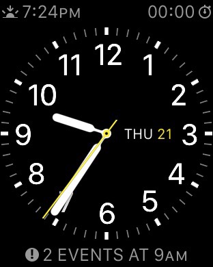
Chronograph start is two taps away (assuming you add the stopwatch complication, of course). Once running, though, you can still see all the other complications and the notifications indicator as well as the elapsed time! Stopping or lap controls are two taps away.
In this first screen shot, you can see the stopwatch in the upper right:
Note the lovely 3D hand overlap. This is actually present on all the analog-look faces, but I chose to show it off here.
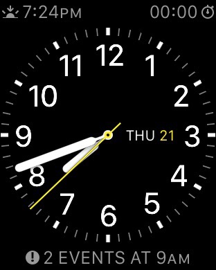
The large complication at the bottom is the calendar view. I can’t overstate how nice the hands and the dial look in real life. These screenshots don’t do it justice.
Color
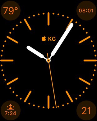
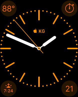
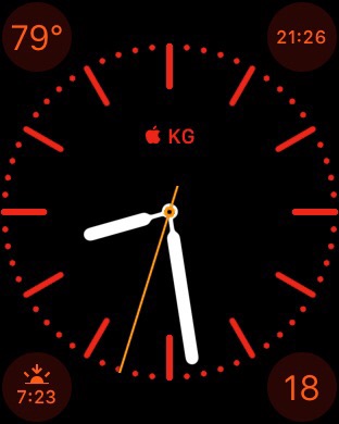
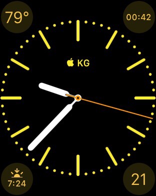
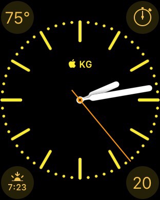
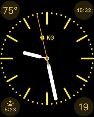
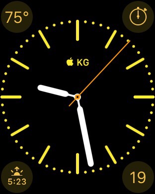
The color face has exactly four complications, plus a “monogram” which is customizable in the iPhone apple watch app.
The reason for this face’s existence, ostensibly, is so you can customize the color of the whole face. The fatal flaw, though, is the non-customizable accent color! For any color you pick, there is a hard-coded accent color on the complications. I hate all the combinations! And to add insult to injury, the second hand is always orange.
If you chose orange, you get a weird other orange on the complications.
If you choose red, you get orange complications.
If you choose yellow, you get orange complications.
I’m sure if you choose white, the gray complications are fine, but why would I choose white?? There are three other faces which do white better.
Oh, and the hour tick marks have no numbers whatsoever. This changes reading the time, for me, from an instantaneous comprehension to a cumbersome mental calculation (ok probably only two seconds or less but feels like the difference between touch typing and hunt-and-peck).
Simple
The simple face is bad because it has identical tick marks for the 30-second mark between each minute, and no hour numbers (well you can add some minute labels but I don’t find them very helpful since you also get even more identical tick marks to obscure the minute!)
At least simple has four-and-a-half complications.
Modular
The modular face is great when you absolutely need the most data possible on your wrist! Modular offers five full complications and one of them allows for up to three lines of text!
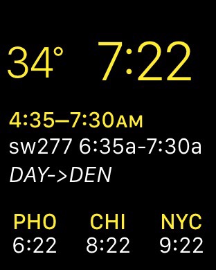
Imagine flying from Phoenix to Dayton with a layover and plane change in Denver. I put three world clocks at the bottom (Phoenix; Chicago, since that’s the time zone my mom was driving to Dayton from; and New York, for Dayton), next calendar appointment on the huge middle complication, and weather on the final complication.
My calendar, of course, has all the flights with the correct timezone-adjusted start and end times, and a compact, data-packed description, including the flight number, airline-reported start and end times, and the origin and destination airports. So whenever you land, you immediately have the local time, all pertinent other time zones, and next flight info (translated to local time!) all in one display. Absolutely indispensable! Just look at this:
I dare you to argue that is not a killer application of a smartwatch. The only way it could get better is via a third-party complication from the airline!
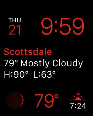
The other situation in which I launch modular: while I’m sleeping. Sounds silly, I know. But say you wake up in the middle of the night and wonder what time it is. I want modular because digital time is still easier to read than analog, plus I added the moon phase, weather, and sunrise time.
Other faces
I occasionally use the astronomy face and the sundial face when I’m at my pool league night just because they look great and I’m really not interested in any data in that setting.
The motion faces are too slow to start to qualify. Once they get going, they are all beautiful, but by then I’ve already dropped my wrist.
And then there’s the Mickey face. Absolutely not for me.
Weather
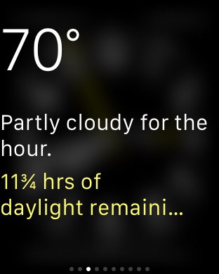
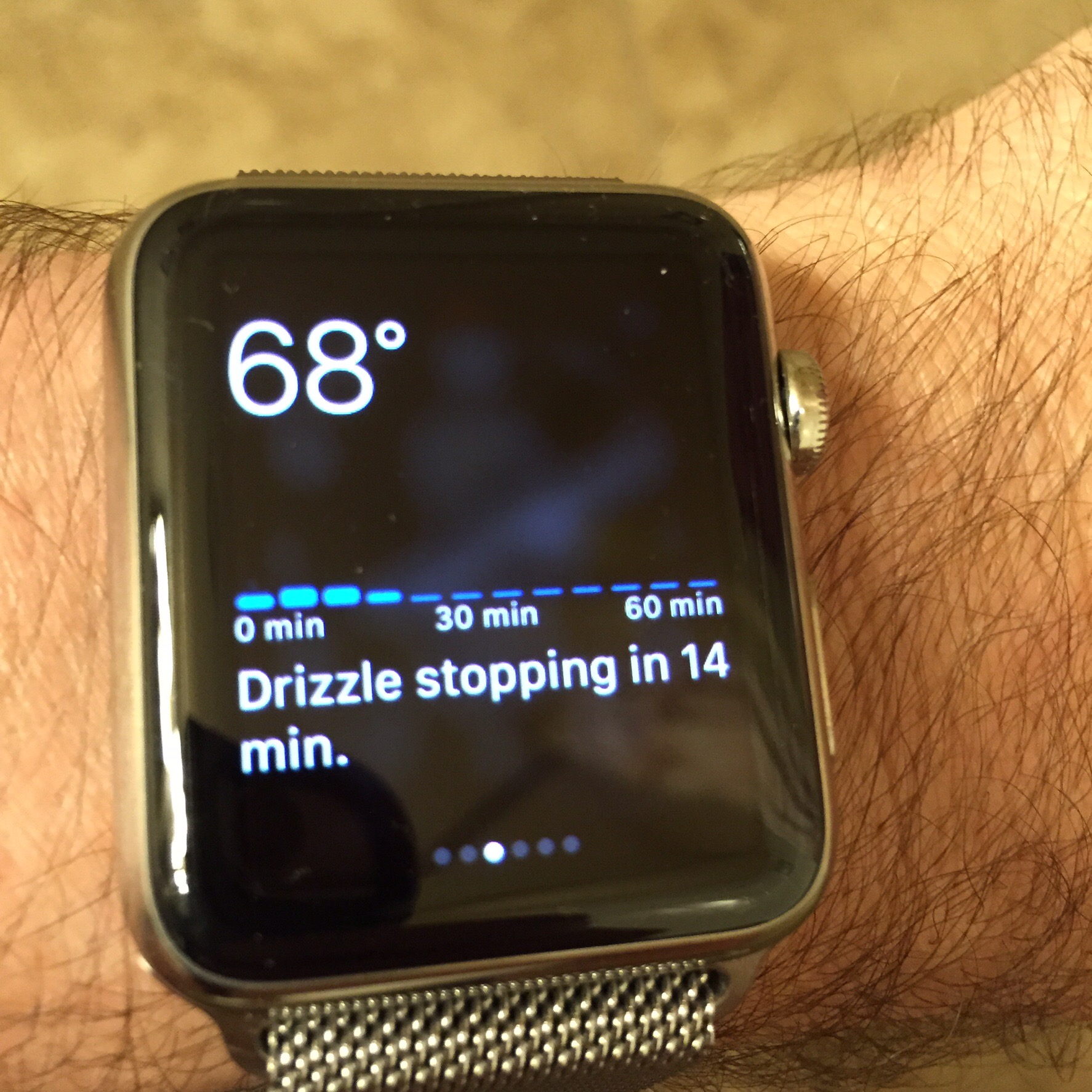
The weather complication is trumped in the accuracy department by the Dark Sky glance but would still be nice to have at the top of the utility face, with the sunset time across from the calendar complication like I have it on the chronograph face. I’m really looking forward to third-party complications, so Dark Sky can take its rightful place on all my watch faces. In the meantime Dark Sky is always the current glance, so it’s one swipe away.
Here’s what the dark sky glance looks like … I forgot to screenshot during actual rain, but do have a de rigueur hairy arm shot.
**Conclusion **
For now it looks like I’m stuck jumping back and forth between the chronograph and utility faces, whenever the whim strikes me. If only the chronograph had a large omnipresent second hand! That would be absolute Nirvana, and I could overlook the bother with complications while the chronograph was running.
If the utility face’s hour numbers were smaller, and it had one more complication, it’d be more satisfying, but I’d still yearn for the chronograph face, I’m sure.
My favorites:
